Natural Care: Skin & Body Therapy
Natural Care: Body & Skin Therapy is an up-and-coming indie skin and body care brand. For natural wellness brands, there is a lack of LGBTQIA+ representation—specifically for the trans community. How do we show inclusivity, while promoting every natural ingredient the brand has to offer?
branding & illustration
product styling
photography

project overview //
- Logo Design & Artwork
- Official Colours
- Style & Typography Guide
- Process
- Results
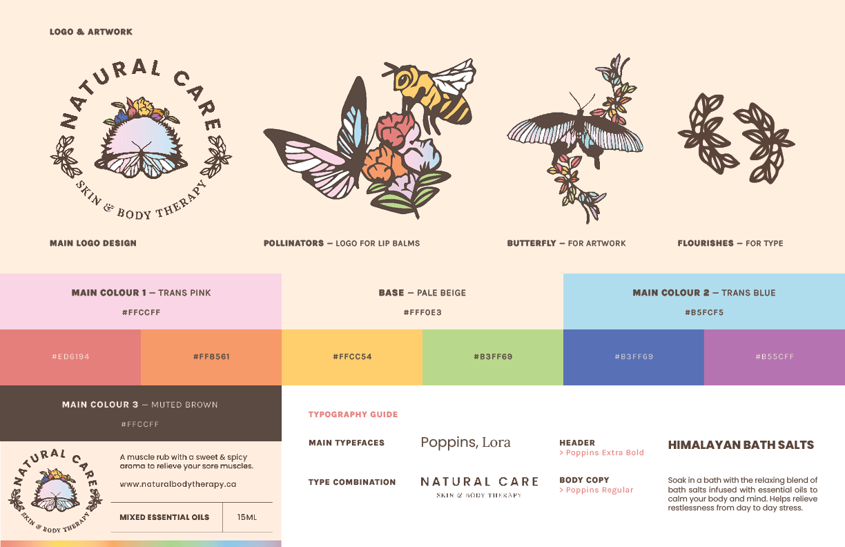
Throughout this project, one of the main challenges I faced was incorporating the colours of both pride and trans flags into their entire visual identity. By muting the palette, not only it equalizes them, but also gives focus on the products as well as the artwork. By using symbols of transformation and nature such as butterflies, birds and bees, it stays true to the brand’s message of being natural while showing your true colours.
After the logo was approved, the client wanted to “hit the ground running” by selling their products at local farmer’s markets in Oshawa, Ontario. So I proceeded to design the product labels, along with the brand’s usage guidelines.
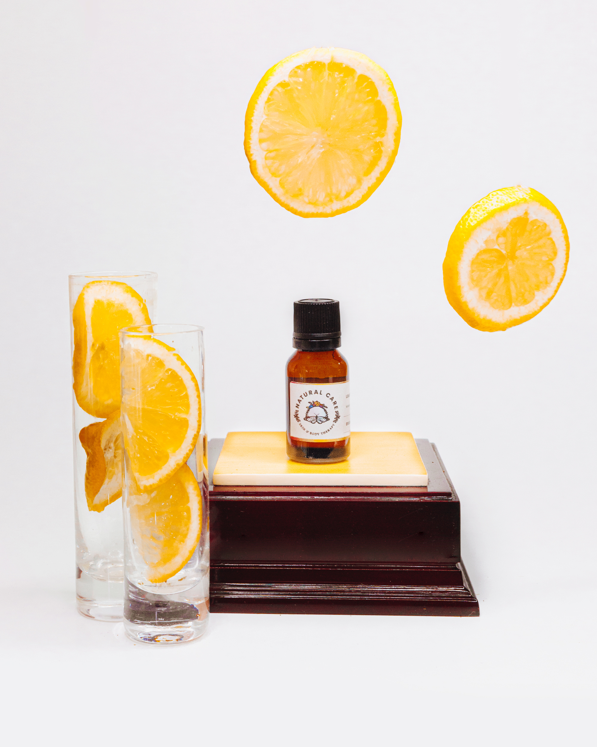
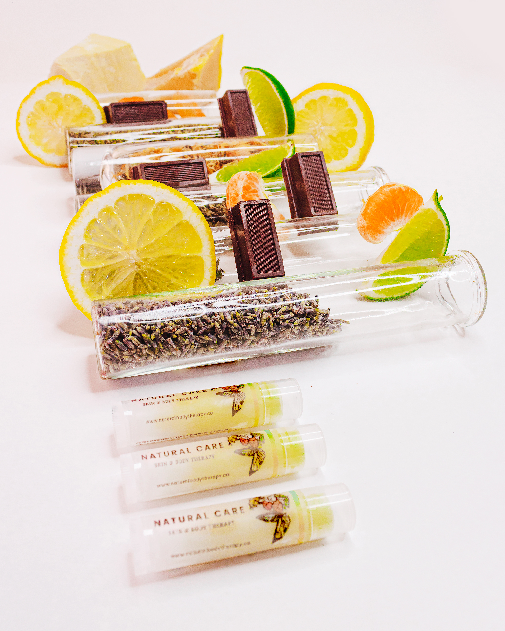
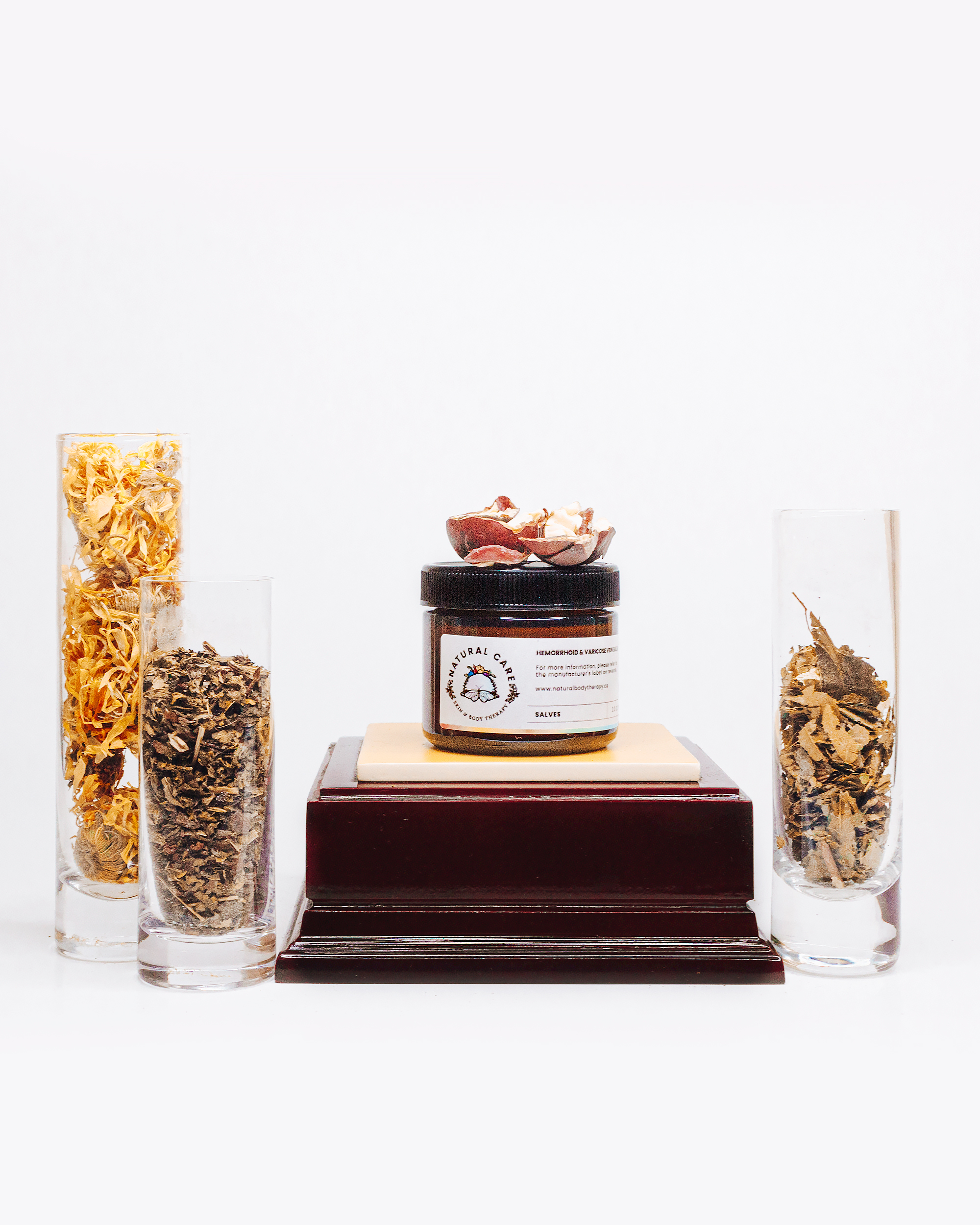
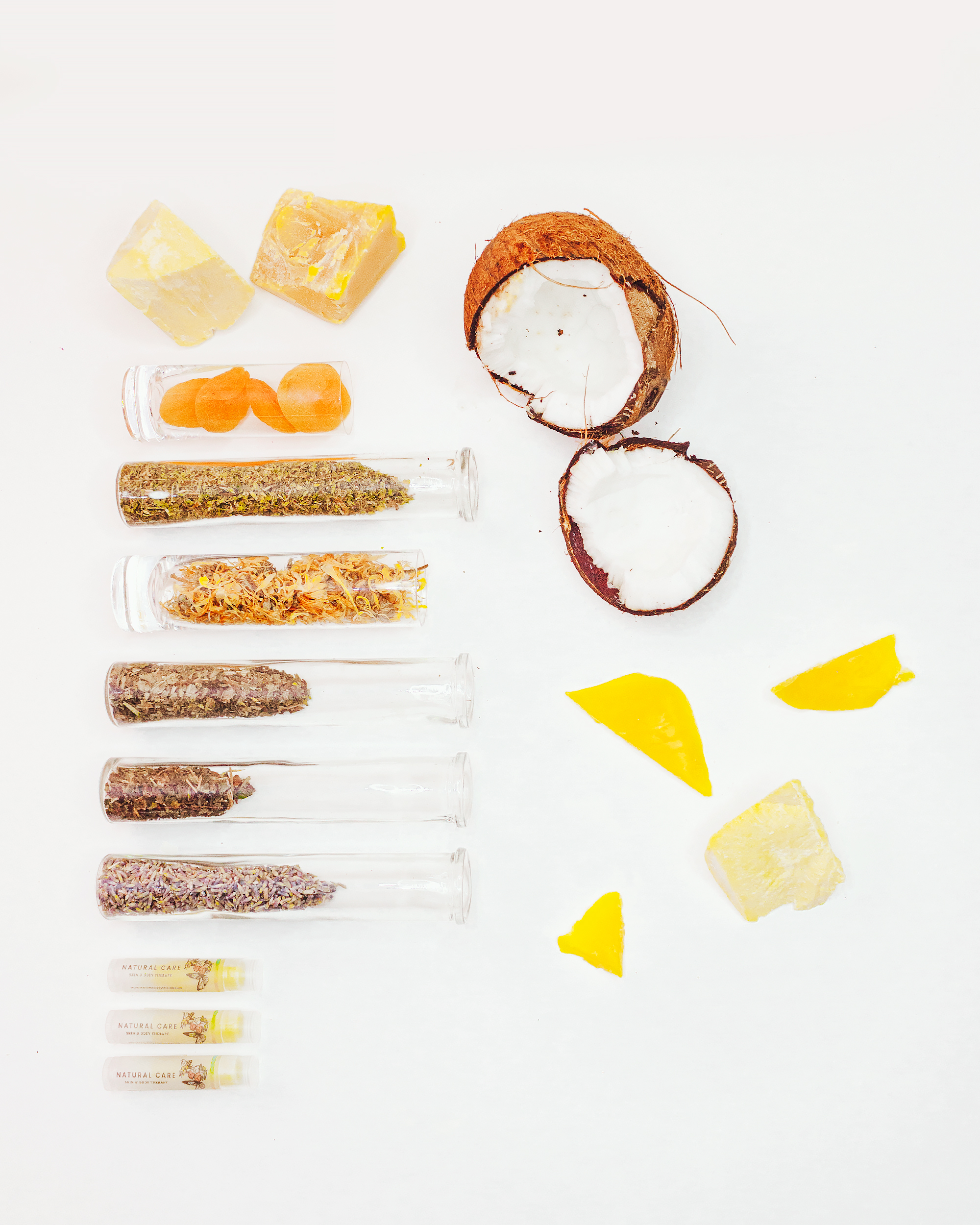
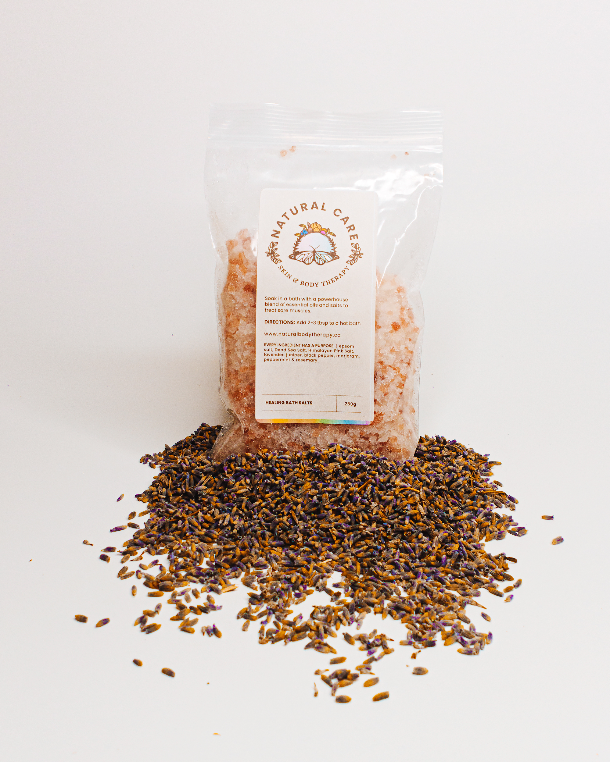
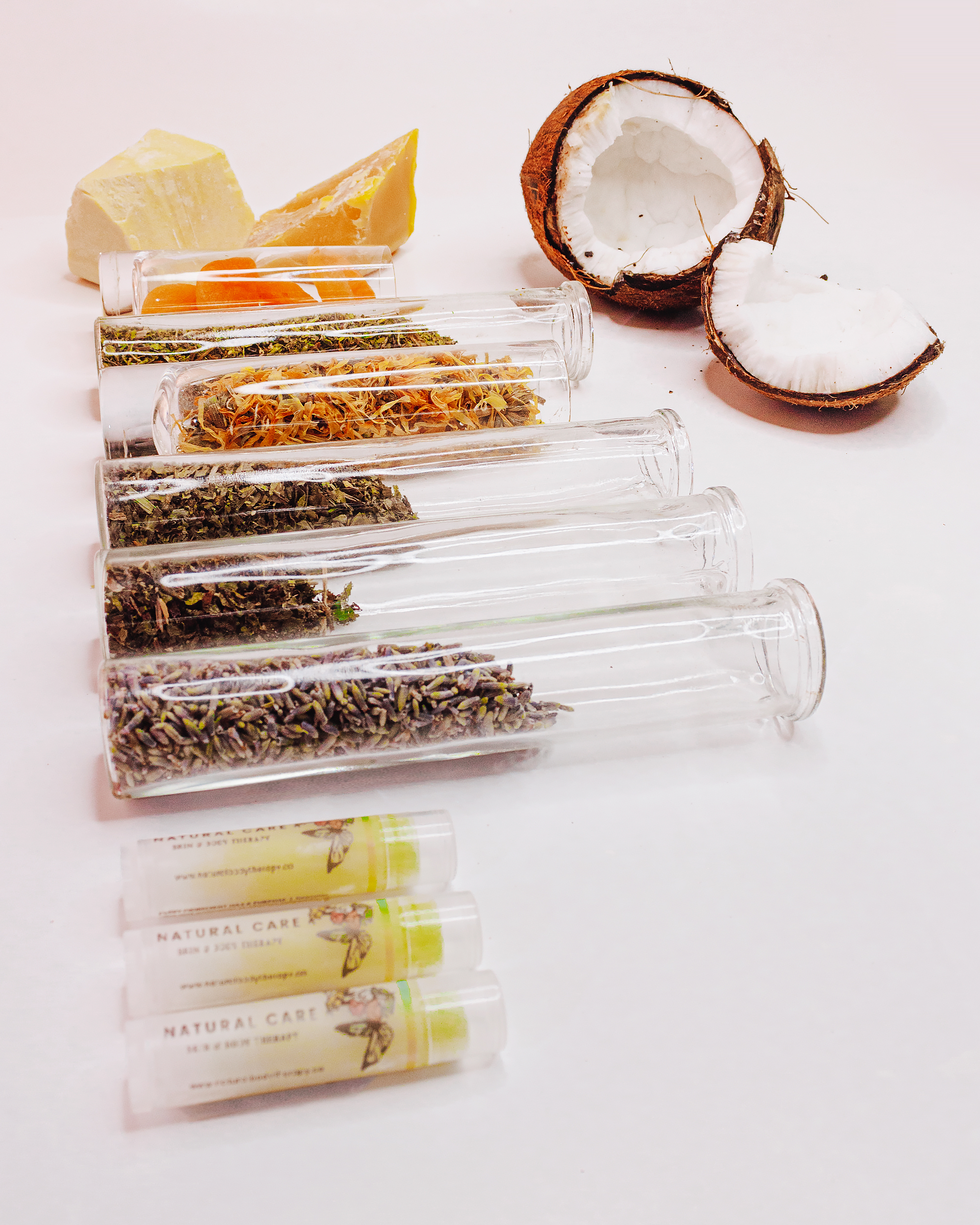
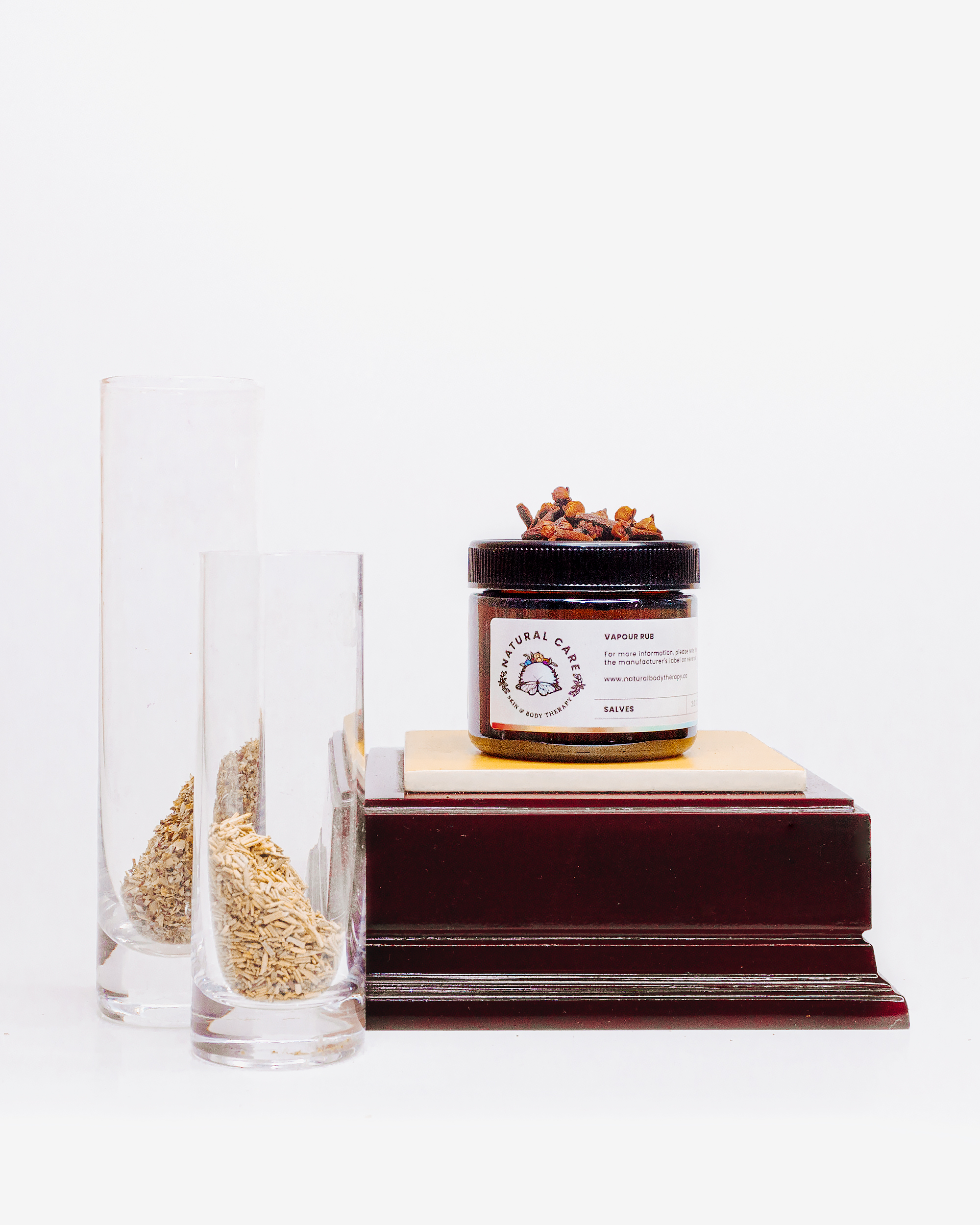
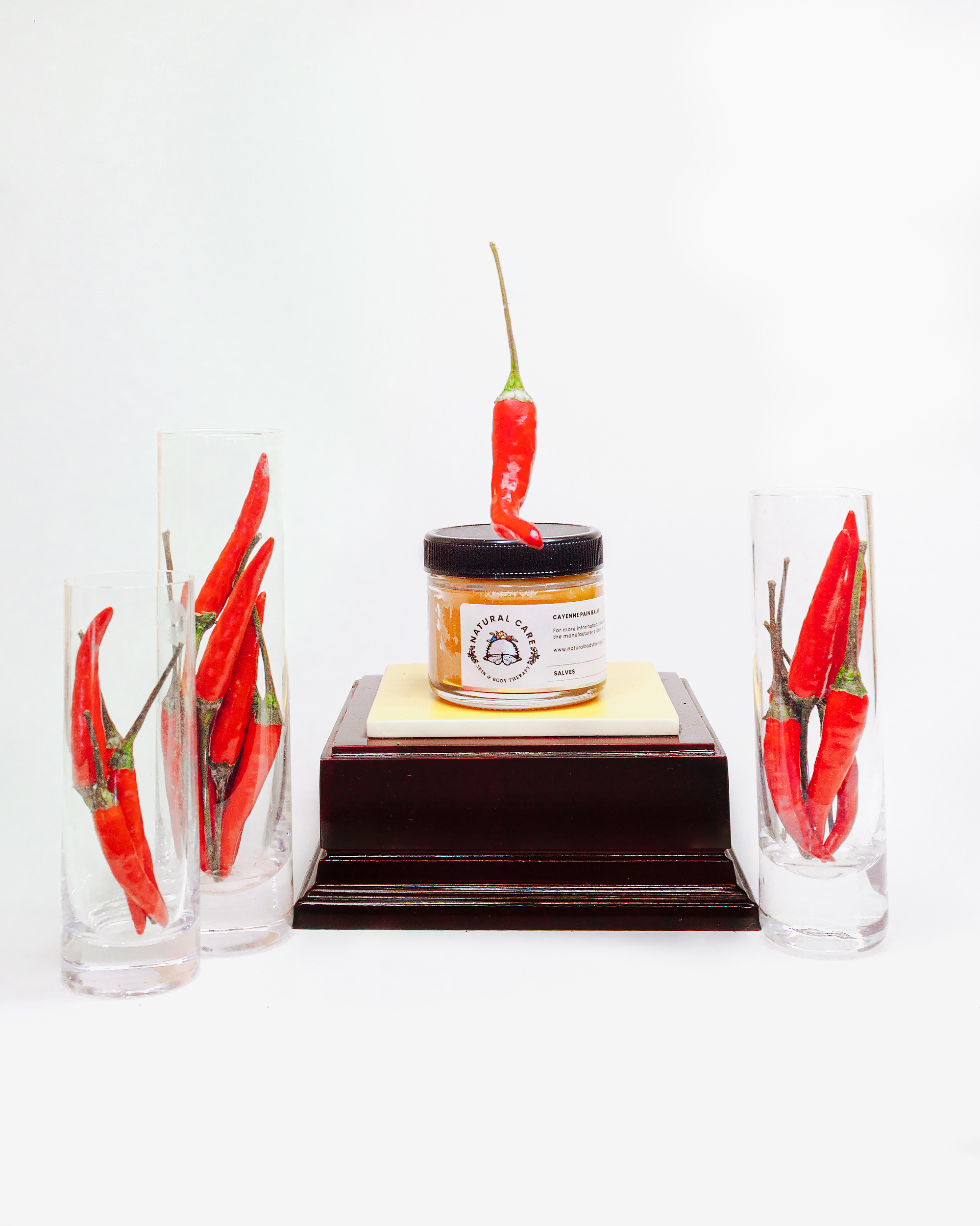
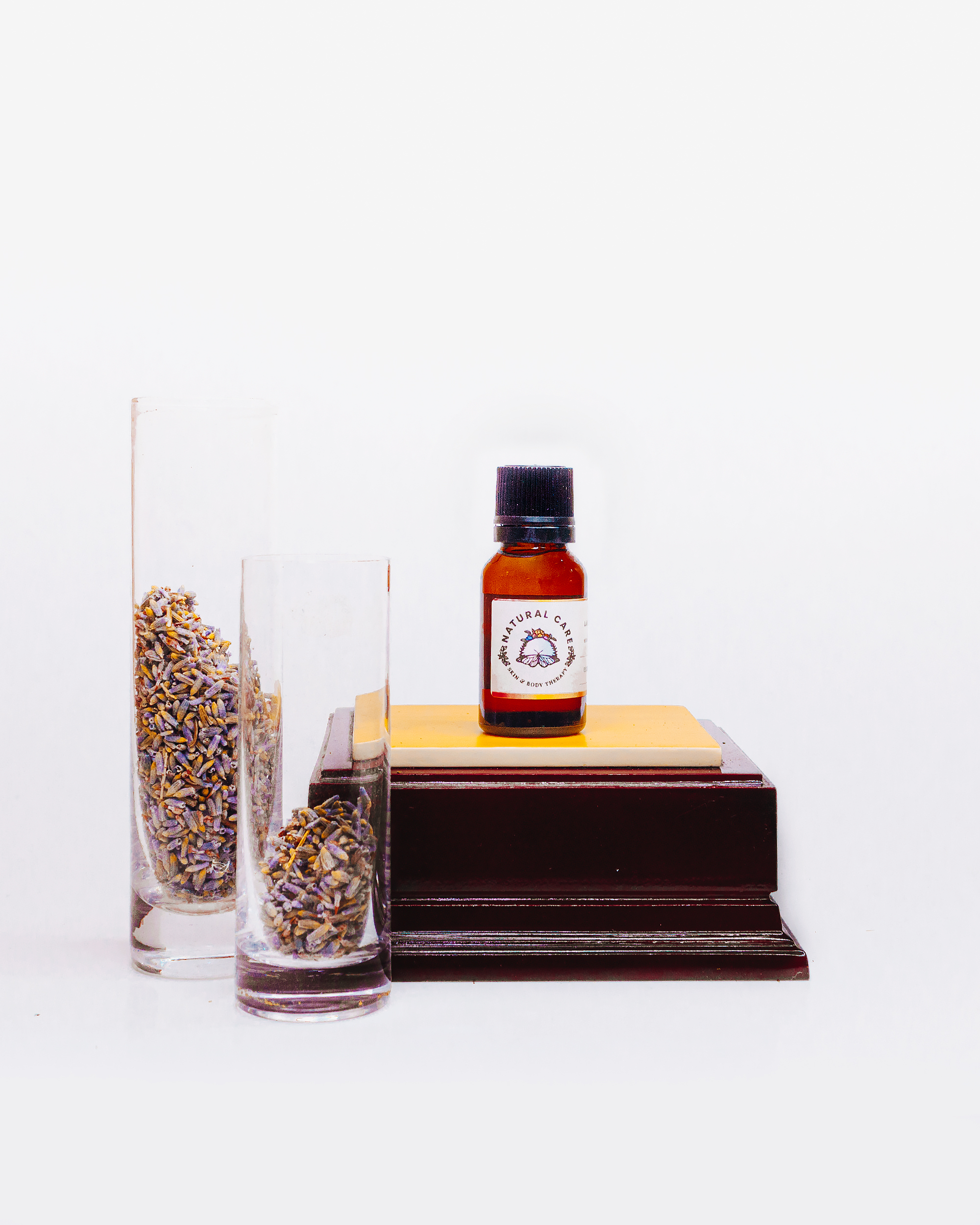
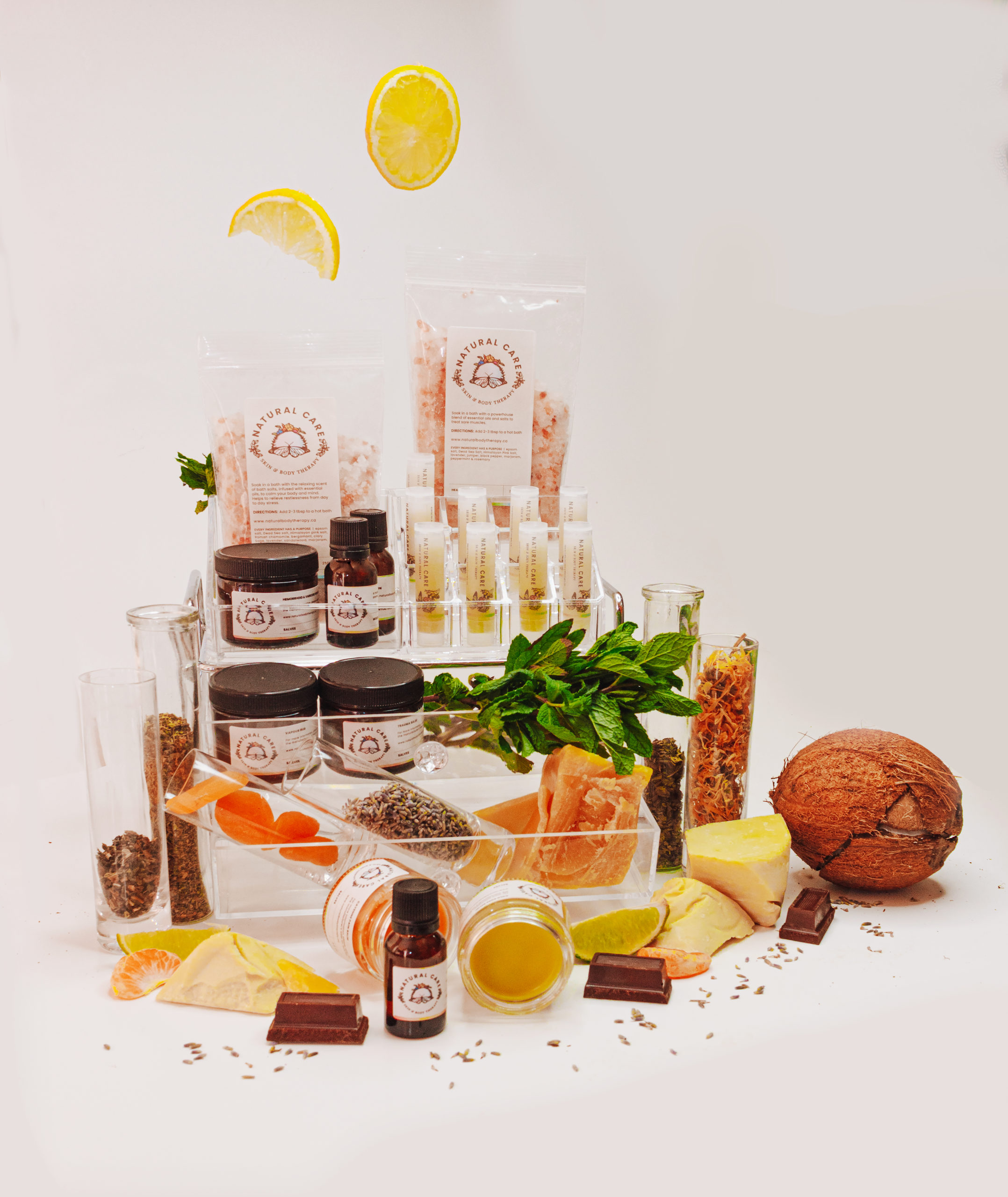
One month later, the client asked me to photograph their initial product line as they launch their business online. The brand guidelines that were developed was expanded onto other channels such as their photography, which featured every natural ingredient of their products. Overall, it enriched and solidified the brand’s look and feel, while amplifying the different colours of the rainbow.
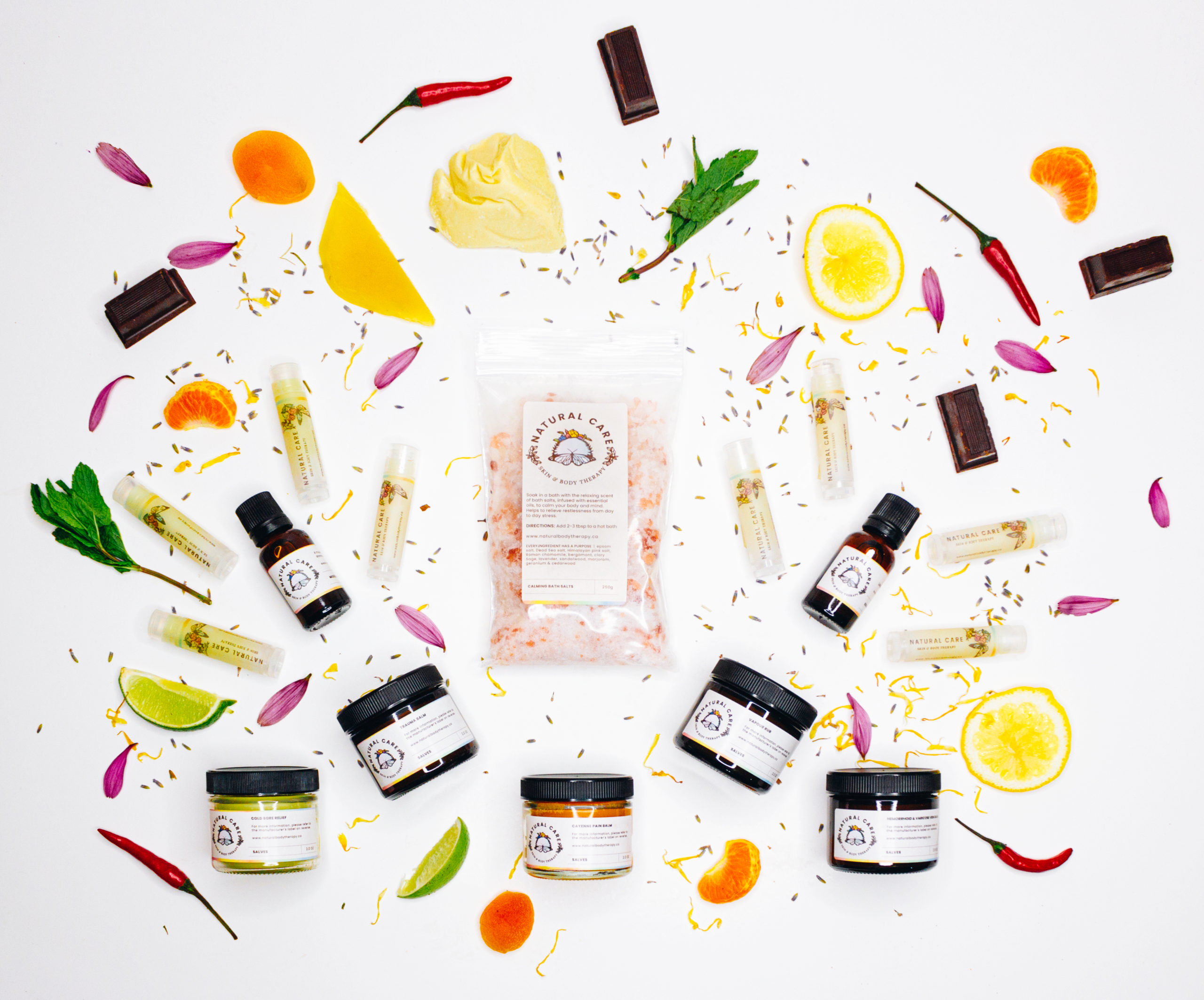
Asides from farmer’s markets across the Greater Toronto Area, it is now available in college and university bookstores such as University of Toronto’s Scarborough campus.
20+
products and counting
5
locations sold at
Credits —
creative director
Yana Vorontsov
branding & illustration
product styling
photography
Jan Cruz
